The Problem
One of the major concerns I had when shifting from the much simpler editor to this new powerful one was:
“Will this new editor be overwhelmingly crowded with features?”.
For some the answer was:
“Yes, definitely.”
The Solution
So to finally try and put an end to the dispute between “Easier but outdated editor” and “Powerful but complex new editor”, I introduced the option to switch interfaces.
How to select your interface
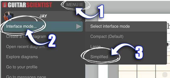
To select your interface you need to reach the option in the top menu, inside the editor.
Your selection will be remembered in your browser’s memory until you make a new selection (or delete your browser’s temporary data).
Detailed steps
- Click on the MENU ☰ icon in the top left of the screen, right next to the logo.
- Move your cursor on "Interface mode…"
- Select your option from the list.
What to Choose
COMPACT
This is the default option, small icons, full toolset, the only choice before the introduction of interfaces. If you are a fast learner, or you already know this editor, the COMPACT option is for you.LARGE
If you don't want to hide functions, but need more help in finding the right buttons, the LARGE option adds a label to each Icon, so it is quicker to locate the right one.SIMPLIFIED
If you are new, or you are used to the old guitarscientist.com/generator, it’s a good idea to start with the SIMPLIFIED interface.
This mode only shows the basic features needed to make quick diagrams.
The set of features available is almost the same as the old generator, all advanced functions are hidden so they don’t clutter the screen when you don’t need them, and all the buttons have a label that explains what they do.
You can switch interfaces as many times as you want.
The best part is that if you need an advanced feature you can quickly switch interface and the full power of the new editor is at your disposal.
